Visualizing New York’s Immigrant Groups
Part of the fun of being a tour guide in New York is stumbling onto events, festivals, and all the other vibrant street life that makes New York special. My last tour was a particularly busy one. My guests and I walked through the markets of Chinatown and caught some preparation for the San Gennaro festival in Little Italy. We then wandered through the Orthodox Jewish blocks of Williamsburg and finally headed to Queens where there was a Momo festival, celebrating Himalayan food and culture. Although the lines at all the dumpling places were so long, that we opted for a street cart selling delicious Bangladeshi Fuksa instead. And we finished it off with a delicious Colombian coffee.

As delightful as all this diversity was, it got me wondering. How unique is this diversity compared to the rest of the United States? Certainly cities like Atlanta, Houston, Los Angeles and Chicago have plenty of immigrant enclaves. New York isn’t the only diverse city in the U.S. In particular, what cultures are here in New York that you won’t find elsewhere in the country? What are our most unique immigrant communities?
My curiosity piqued, I went the the obvious source for an answer: The U.S. Census Bureau. Typically when Americans answer the Census, they just answer some basic questions, but a smaller number of Americans are selected to answer the more detailed American Community Survey. This dataset is where one can find much more granular and intriguing data about the demographics and socio-economics of the United States.
PRE-PROCESSING THE DATA

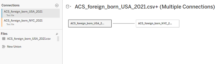
I knew I wanted to compare the raw and relative populations of the foreign born population nationwide and within New York City. So I generated two reports and created two CSV files to compare. I was able to do the needed filtering to create data for NYC right on the census data website.

CLEANING THE DATA
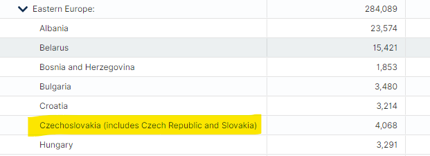
The datasets were fairly small and could be cleaned easily in excel. One issue was that the reports included a lot of aggregated rows where the total foreign born population of various regions were listed and the individual countries were indented rows beneath that. I was more interested in comparing countries than regions, so I deleted the regional aggregate rows. There were also some countries that were broken into constituent nations. For instance, the UK had an aggregate total as well as subtotals for England, Scotland, and the remaining UK territories. China also had Hong Kong and Taiwan subdivided from its total. There were also just some strange naming choices. I assumed that the “other Australian and New Zealand subregion” meant New Zealand, given that the other row in the group was for “Australia.” And I can’t imagine why Czechia and Slovakia were still being grouped as one country thirty years after they split into independent nations. I didn’t have any way to discern each nation’s population in the U.S. So “Czechoslovakia” it is, I guess.
There were also a number of aggregate rows that grouped small national groups into larger regional groups without delineating national origins. For instance, there was a large category of “Other West African” that included many non-specified countries. This data wasn’t really useful to my goal, but I left it in the dataset for reference.
One trick that momentarily stumped me was trimming the whitespace from the indented country names in the CSV file. They needed to be trimmed to allow for easy visualization and coding, but running a simple TRIM function wasn’t getting any result. Some troubleshooting revealed that the offending whitespace was a “non-breaking space” that was created during HTML conversions. I applied the function =TRIM(SUBSTITUTE(A1, CHAR(160), “ “)) to resolve the issue. Now I had two tidy datasets with identical country names that could be used as a primary key for comparison.
VISUALIZING THE DATA
View the visualization in Tableau with a free account
I decided to use Tableau to familiarize myself with the data. I felt that seeing everything mapped out would be a great way to get to know what I was dealing with.
I started by mapping the NYC foreign born population data. The first thing to jump out was just how big the population from China and the Dominican Republic is. There are more than 300,000 Chinese-born New Yorkers — plus another 50,000 or so from Hong Kong and Taiwan. But the Dominican Republic remains firmly the largest immigrant group in New York with roughly 420,000 Dominican-born New Yorkers. That’s about the same population as the entire city of Minneapolis!
Next came a group of countries each with more than 100,000 nationals living in New York: Jamaica, Mexico, Guyana, Ecuador, and Bangladesh. Mexico is, of course, no surprise given how many Mexican immigrants live all over the U.S. But the most surprising of that list is Guyana. Guyana is a small nation on the Caribbean coast of South America and the population is only about 750,000. So that means that there is 1 Guyanese in New York City for every 5 in Guyana!
After that, the list spread out into many nations on many continents. I was surprised to see so many Western European nations well represented on the list. I don’t tend to think of French or Danish “immigrants” living in New York, perhaps because I think of people from those nations as more transient professionals that aren’t as rooted in New York as immigrants from Latin America or Asia. But I have no data to back up that assumption, and I suppose a Parisienne who moves here full-time to work in a professional job is statistically no different than a Chinese or Mexican kitchen worker. There may even be lots of French kitchen workers around! I also found my own neighborhood demographics had biased my assumptions about NYCs demographic makeup. My corner of Queens has many Irish bars, restaurants, and cultural institutions and I know many Irish-born New Yorkers from my time living here. But according to the data, there are a mere 9,000 Irish-born New Yorkers — less than from France, Germany, or even England!
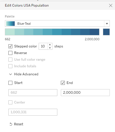
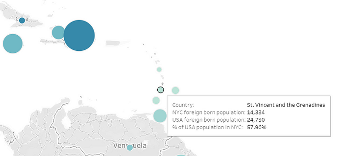
After perusing the data, it was time to link the NYC and USA data in a single visual. I decided to create a symbol map where a circle represented each country in the dataset. The size of the circle would represent the foreign born population in NYC, and a color gradient would represent the foreign born population nationwide. So a large, light-colored circle would mean a community with a large NYC population but a small one nationwide and vice-versa.
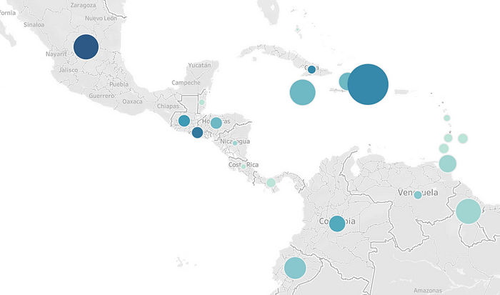
One of the decisions to be made with the color grading had to do with Mexican immigrants. Nationally, Mexicans make up a huge percentage of all foreign-born Americans. There are more than 10 million Mexican-born residents nationwide, and the next largest group is Indian-born with a mere 2.7 million residents in America. So creating a proportional color gradient for nationwide populations would have led to a very dark circle for Mexico and everywhere else being mostly the same color. So I decided to make 2 million people the high point of the color gradient. This resulted in visually diminishing how large the Mexican-born population is nationally, but allowed for more detailed comparisons of other nations.
I was now able to really see where NYC’s immigrant population was unique compared to elsewhere in the U.S.
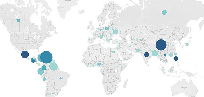
The largest cluster of immigrants to New York clearly come from the Caribbean, Central America, and Northern South America. East and South Asia also is a large cluster. And Eastern and Southern Europe is still visible as a significant cluster, especially if you consider the geomarker for Russia is placed in the middle of Asian Siberia where it visually is hard to connect with Europe.
Asia presented a great visual for identifying foreign born communities both over and under represented in New York.
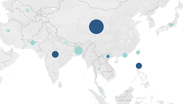
Dark, medium-sized circles in India, The Philippines and Vietnam indicated relatively small communities in New York, whereas noticeable lighter circles in Uzbekistan, Nepal, and especially Bangladesh indicated places with relatively large communities in New York.
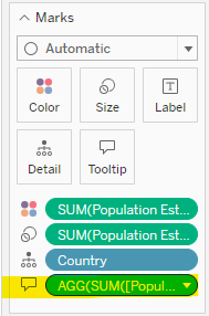
But I wanted to be able to see more. I wanted to be able to tell at a glance what percentage of America’s residents from a particular nation lived in New York City. Hovering over each circle automatically displayed the raw totals, but I wanted to make sure that those numbers made immediate sense to a viewer by including a percentage.
Now I was able to see at a glance what percentage of America’s immigrants from any nation lived in NYC.
A final way of parsing the data would be to create an ordered list of the NYC population percentage by nation. A SQL script joining the two tables was a quick solution.
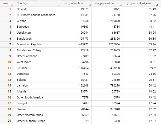
The results showed the Caribbean made up much of the most unique groups in New York, with the top four spots all coming from the Caribbean (Guyana is geographically part of South America, but is often considered part of the Caribbean). Uzbekistan and Bangladesh were the only Asian nations in the top 20. There were also some unmapped categories such as “Other Caribbean” that made their way into the final rankings. On the other hand, the bottom 20 were a very interesting list
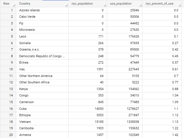
The list is dominated by small island nations, Southeast Asia, Central and East Africa. Somehow of the 176,000 Laotians in the U.S. only 170 or so live in New York City! Also, I had no idea that 50,000 Cape Verdeans lived in the U.S.
CONCLUSIONS AND FURTHER ANALYSIS
While these lists are certainly interesting, they don’t offer any explanations as to why some groups are clustered in New York and other aren’t. It’s not surprising that an established immigrant community will grow in one place, rather than spawn multiple small communities. But why some groups and not others? Looking at the list of least represented groups I had a theory. There are different methods for immigrants to achieve legal status in the U.S. including family connections, job sponsorship, asylum claims, and refugee resettlement. Looking at the bottom 20, there seemed like a lot of nations like Iraq or Somalia that could represent a lot of refugees and asylees. To look into this I found a Dept. of Homeland Security report on immigrant flows that included some refugee data.
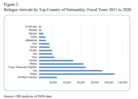
And there we can see that 6 of the 15 on the list are in NYC’s bottom 20 (Iraq, Eritrea, DR Congo, Somalia, Ethiopia, & Cuba) and only 1 (Ukraine) is in NYC’s top 20. Other nations in NYC’s bottom 20 such as Vietnam and Laos could have plausibly been large sources of refugees in previous decades. It does make some intuitive sense that if the U.S. government is settling refugees they wouldn’t do so in a city with some of the highest housing prices in the country. So this is a theory that could be ripe for further analysis.
Another area for further research is breaking out religious or ethnic minorities within national groups. In my neighborhood, many immigrants are from Tibet but in the data they would be considered from China despite their unique culture, religion and language. Indo-Guyanese are another example in New York City or Hmong communities in other parts of the country. There are also distinct ethnic/linguistic groups that are born in the United States unrepresented in the data, such as Brooklyn’s large Yiddish-speaking Orthodox Jewish enclaves. It would be interesting to find some data that breaks down ethnic communities in New York, and not just national ones.
But this was a fun project nevertheless. And I can now have a firm recommendation if I’m ever asked for the most unique cultural event in New York. Come for a visit on Labor Day for the West Indian Day Parade and enjoy the culture of the most Caribbean city in the United States.